
UbiOps
2024
UbiOps is a machine learning operations platform that simplifies the deployment and management of machine learning (ML) models. Users can easily orchestrate and run AI workloads locally, in a hybrid cloud or across multiple clouds using the intuitive webapp.
Although the app has a loyal user base, feedback indicated that prolonged use of the default light theme led to eye strain and reduced productivity. Our goal was to redesign the app with a dark mode option that enhanced usability, improved accessibility, and provided a modern aesthetic while preserving the technical precision that users expect.
ROLE
User Experience
Visual Design
Research
Wireframing
Usability Testing
Prototyping
TEAM
UX Researchers
Project Managers
Developers
DURATION
6 Months
READ TIME
10 Minutes
The Challenge
The existing light-themed interface, while functional, was not optimised for extended use in low-light environments - a common scenario for our target users.
Visual Fatigue
Prolonged exposure to bright screens caused eye strain, impacting productivity.
Brand Inconsistency
The technical nature of the app required a balance between a modern dark aesthetic and clear, precise information display.
User Adoption
Making the transition to dark mode seamless for both current users and new users accustomed to dark-themed environments.
Accessibility
Ensuring adequate contrast and readability for users with visual impairments.
Darkmode needed to enhance the users experience of UbiOps and give it a sleek and modern look.
Design Process
We adopted the Goal-Orientated Design Process (GDD)
Methodology. It focuses on understanding users' goals, behaviours, and needs to create products that align with their workflows.
🔍 Research → 🎭 Modeling → 📋 Requirements → 🎨 Framework → 🛠️ Refinement → 🚀 Development
Research & Insights
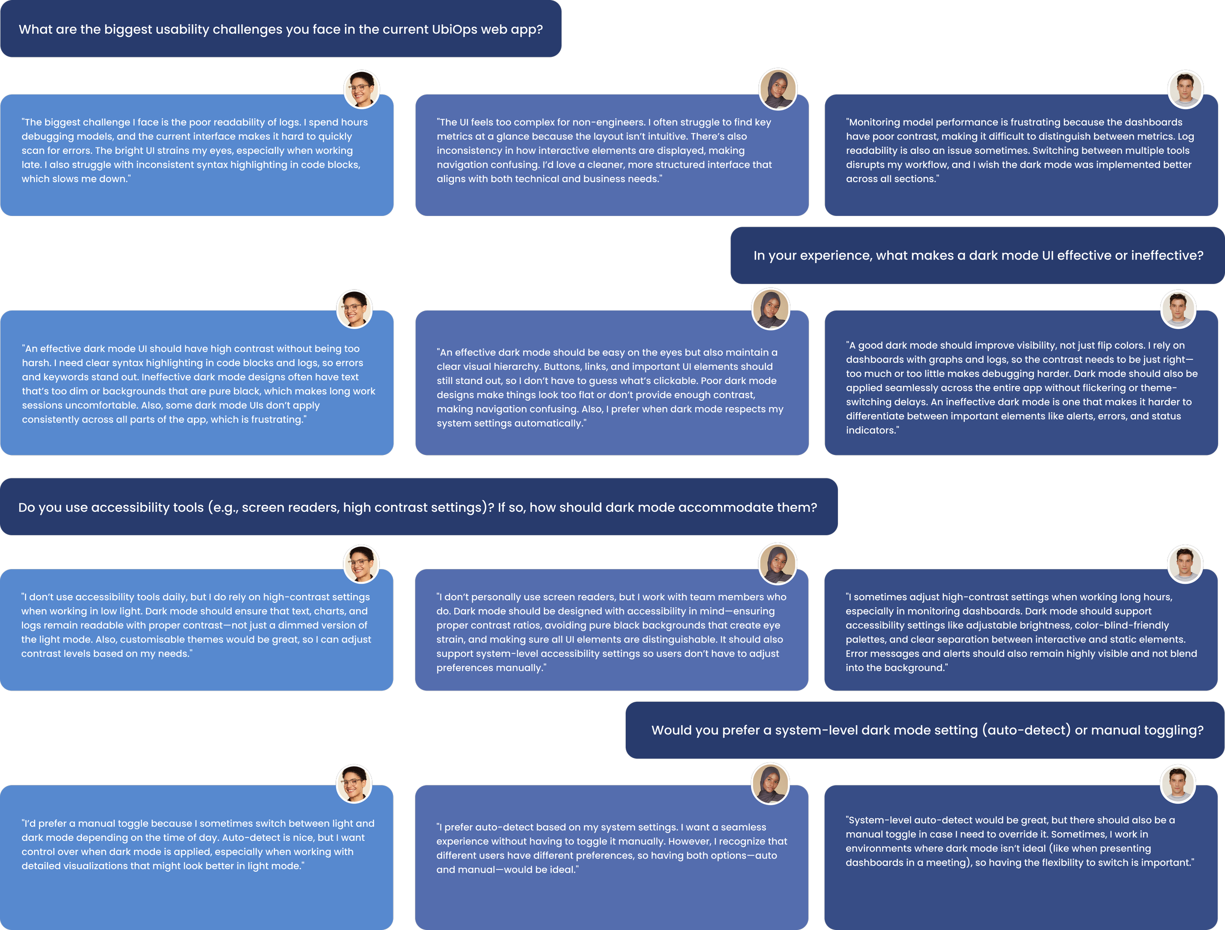
User Interviews & Surveys
We conducted interviews with 30 users, including software engineers, data scientists, and system administrators.
Preference For Dark Mode - Over 70% of users already used dark mode on other applications and expressed a desire for a similar experience.
Reduced Eye Strain - Users reported less eye fatigue and better concentration when using dark interfaces.
Demand For Customisation - Many users wanted the option to switch themes on the fly and adjust contrast levels to suit their personal preferences.
Technical Clarity - Despite the dark aesthetic, users needed high precision in data visualisation and code readability.
Competitive Analysis
We evaluated popular technical web apps that offer dark mode, such as GitHub, Visual Studio Code, and Slack. Best practices observed included:
High Contrast Colours - Effective use of colour contrast to maintain readability.
Consistent Visual Hierarchy - Clear separation of interface elements to avoid visual clutter.
Customisation Options - Allowing users to fine-tune brightness and accent colours.
Smooth Transition - Seamless switching between light and dark modes without disrupting user workflow.
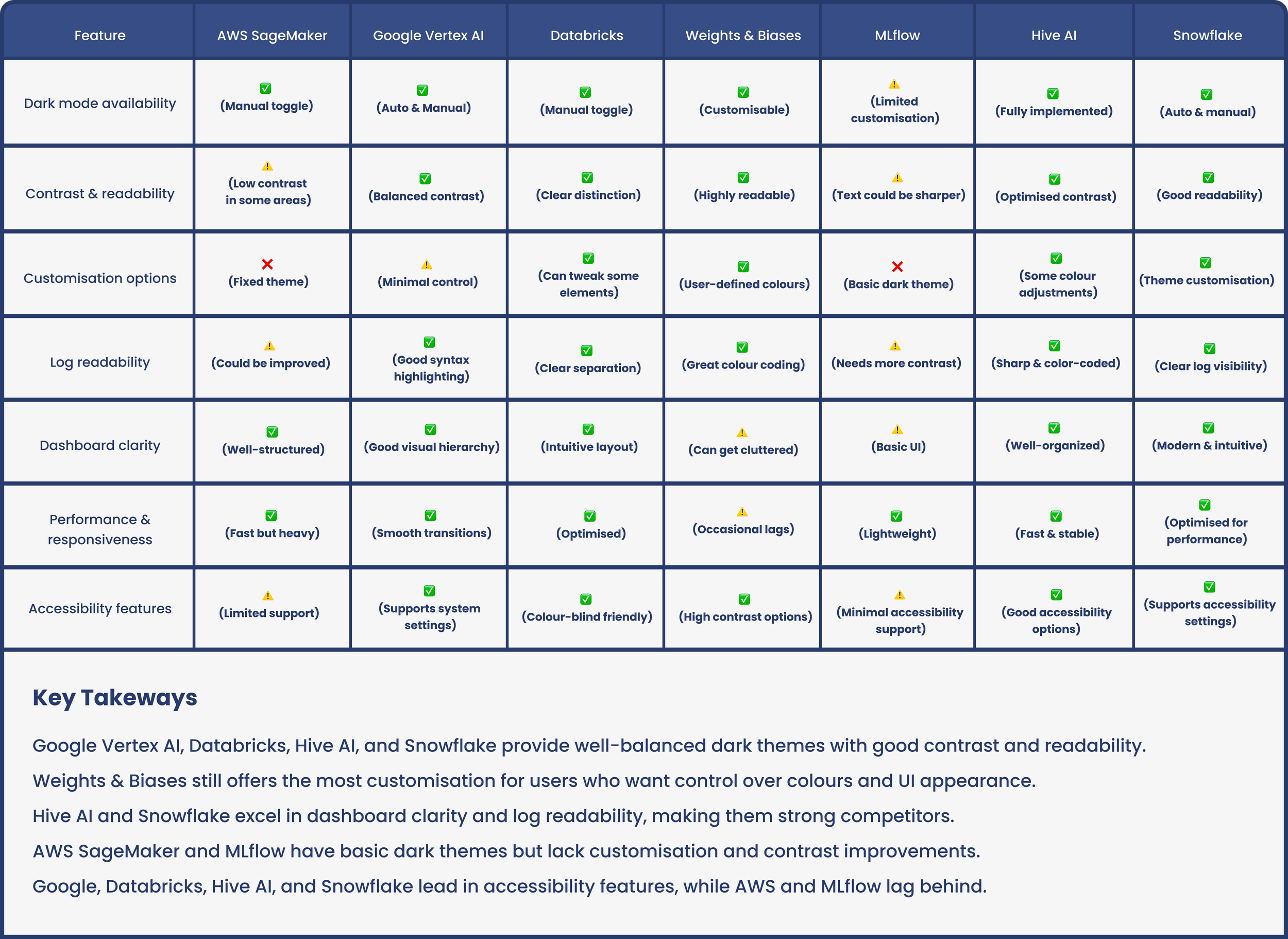
Competior Analysis
Studying competitors’ dual-theme strategies to optimise clarity, readability, accessibility, and performance in Dark Mode.
Key Takeaways
Users want control of the UI’s appearance
Customisation to add brand colours is preferred
Dark themes need good contrast and readability
Needs to meet accessibility standards
Initial Ideas
Our initial workshops with stakeholders and users led to a shared vision:
Dual-Theme Flexibility - A system that lets users toggle between light and dark modes without losing context.
Clear Hierarchy & Contrast - Maintain the technical clarity of the app with distinct visual separations for navigation, content, and interactive elements.
Customisation Settings - Incorporate settings that allow users to adjust brightness, contrast, and accent colors in dark mode.
Creating a component library for Darkmode
From our lightmode version in Figma, I duplicated the existing components and systematically modified their colour properties, such as fills, strokes, and text colours, to darker tones suitable for dark mode. I structured the components using Figma Variants to enable easy toggling between light and dark themes, ensuring consistency and maintainability. Additionally, I used color styles for effortless updates and tested the components for accessibility standards like contrast ratios. This approach streamlined the process of building a versatile, adaptable design system that supports seamless theme switching for enhanced user experience.


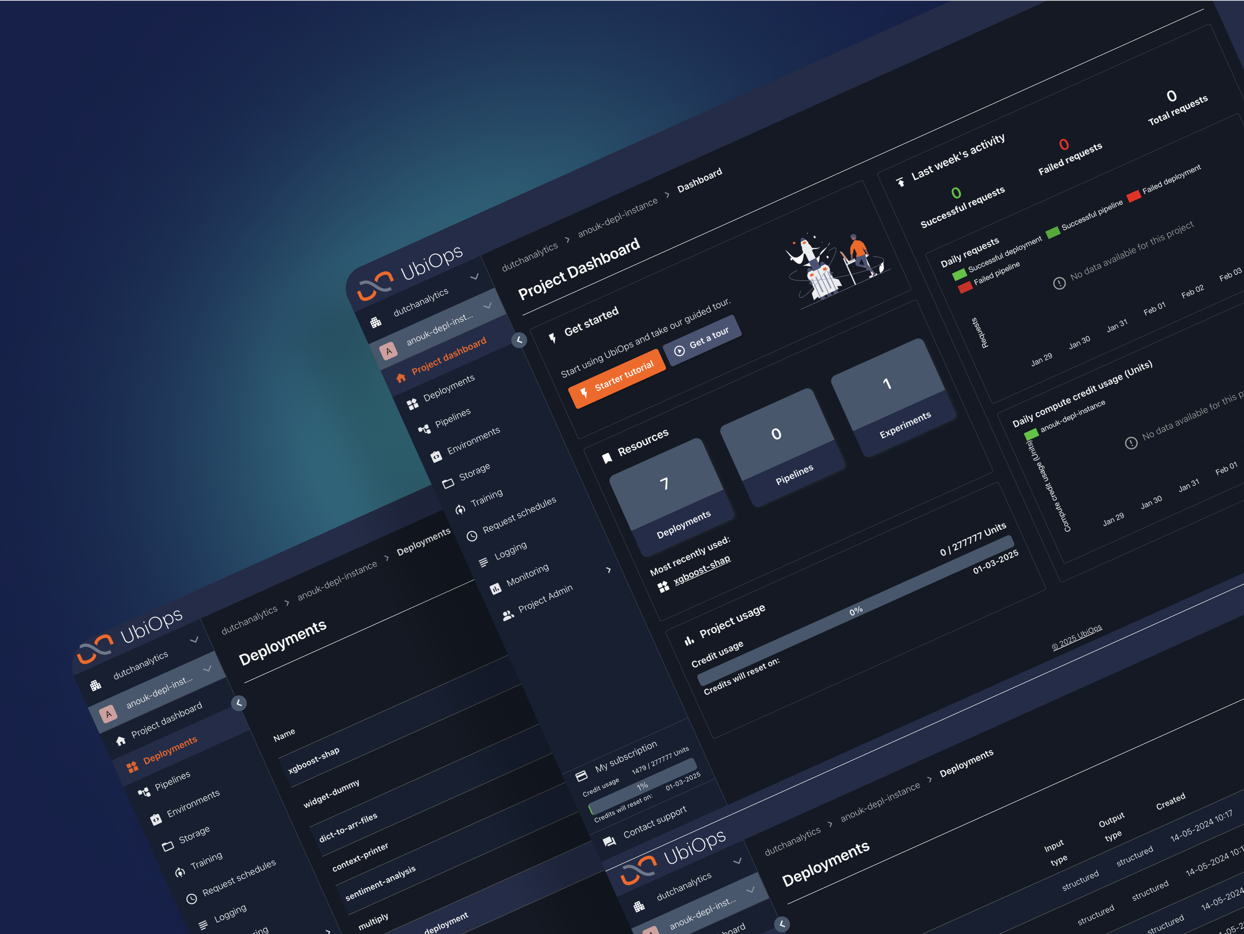
High-Fidelity Prototypes
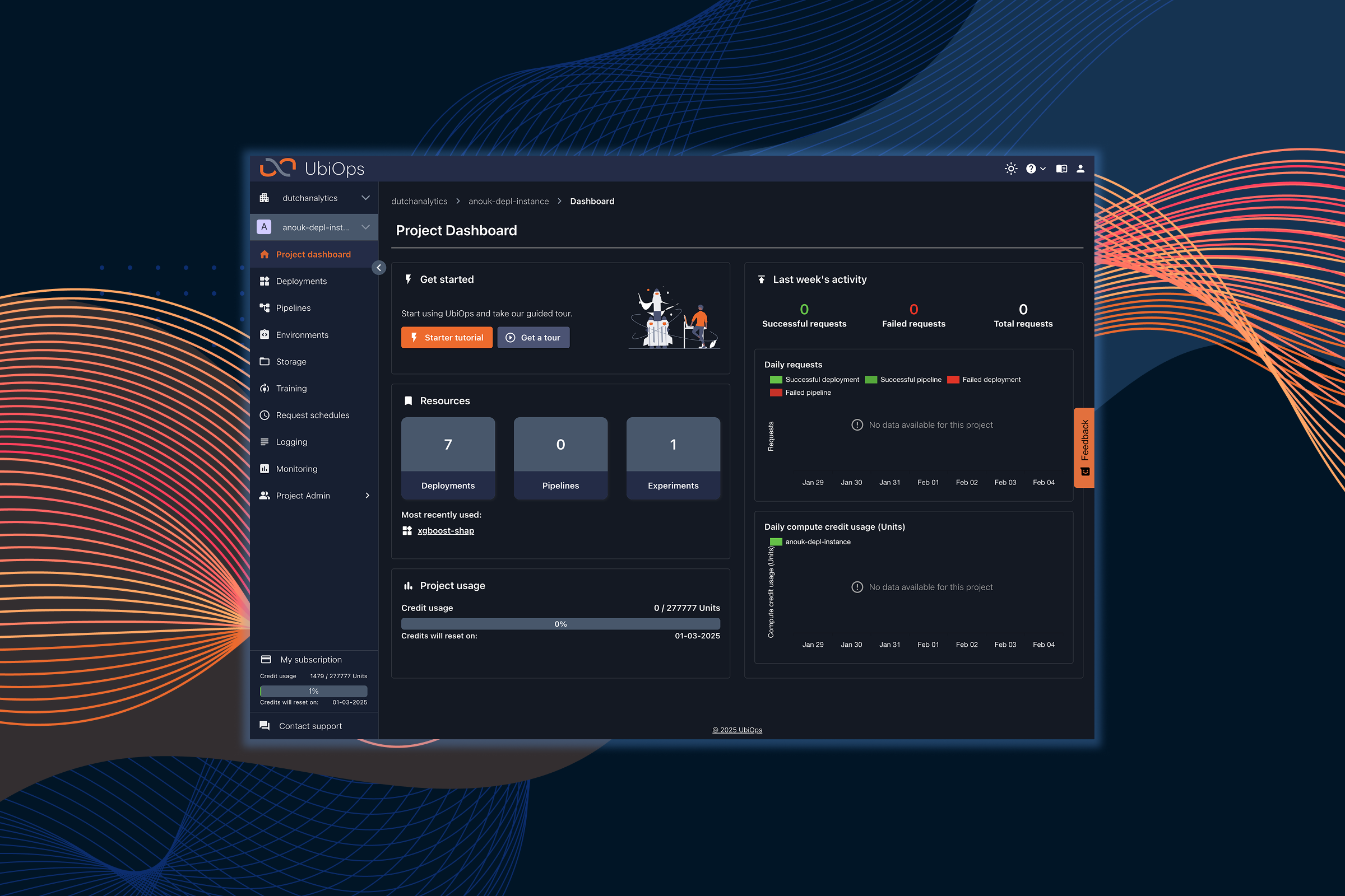
We developed interactive prototypes with a dark mode toggle. This easy to access toggle is prominent and within the header bar. A carefully curated colour palette using deep blues, soft greys and vibrant accent colours for interactive elements was constructed. Microinteractions such as hover states, active indicators were enhanced to maintain a responsive and engageing experience.

Usability Testing
We performed several rounds of usability testing with current users:
A/B Testing - Compared the dark mode against the traditional light theme, with users reporting a 60% preference for dark mode.
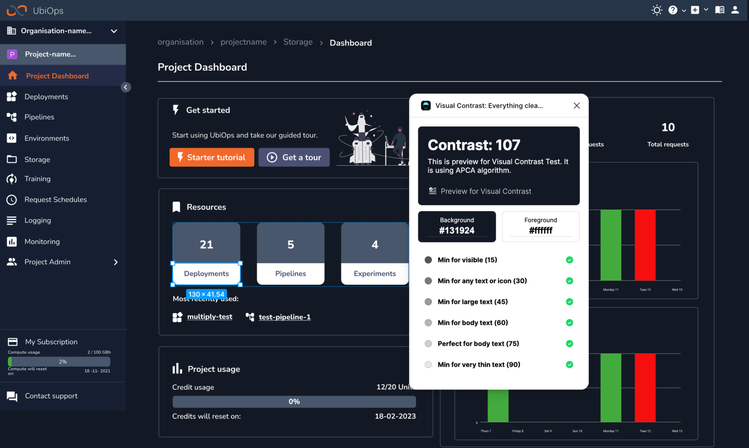
Accessibility Evaluation - We consulted with W3C to ensure sufficient contrast ratios and screen-reader compatibility.
Iterative Refinement - Based on feedback, we fine-tuned contrast levels, adjusted font weights, and optimised colour choices for charts and data visualisations.
Infographics - Nudged users at key stages throughout the UI linking back to technical documentation & guiding them towards the next step in the process.

Final Design
Key Features
Seamless Dark Mode Toggle
A prominent toggle was implemented, accessible from the main header bar. Smooth transition animations that maintain user context were incorporated.
Optimised Colour Palette
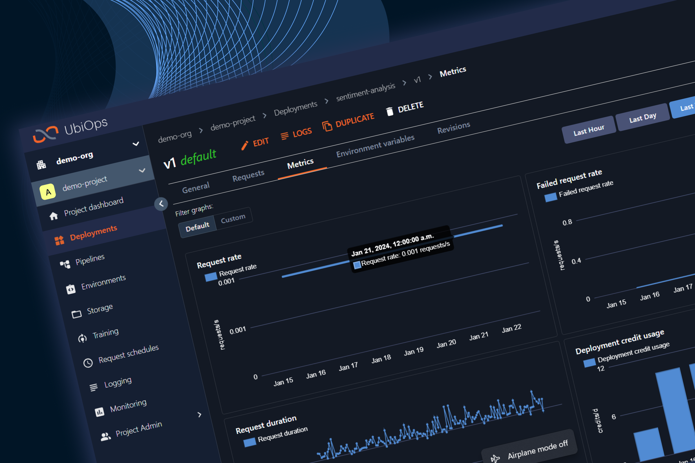
Deep blue backgrounds reduced screen glare, whilst vibrant colours were used for actionable items such as buttons, links and notifications to maintain clarity. Enhanced contrast for text and data visualisations ensured that there was readability, even in low-light conditions.
Customisation Options
Libraries we synced between Figma and the Front-End code to enable ease when adjusting colours and to ensure ease when developing personalised interfaces.
Technical Precision
We maintained a clear delineation of data visualisations, code blocks and navigation elements. Microinteractions and visual feedback were designed to support complex workflows without distraction.
Visual & Interaction Design
Aesthetic - A modern, sleek and dark interface that feels both technical and inviting.
Typography & Icons - Clean, sans-serif fonts with adjusted weights for better readability. Simple, high-contrast icons that enhance navigation and usability.
Microinteractions - Smooth animations and responsive feedback that create a sense of control and precision.
Impact & Learnings
Key Takeways
User Centered Design - Direct input from users was invaluable in tailoring dark mode to meet technical and ergonomic needs.
Balancing Aesthetics & Functionality - The challenge was to create a visually appealing dark mode that didn’t compromise the clarity required for technical work.
Iterative Testing - Continuous testing ensured that the redesigned interface met accessibility standards and user expectations.
Customisation Enhances Engagement - Offering personalisation options increased user satisfaction and engagement with the new theme.
Outcomes
Stats & Feedback